
Color psychology: how to choose the right palette for your space

Color psychology is the study of hues as a determinant of human behavior. Colors have the power to evoke emotions and influence our mood, productivity, and even appetite. Understanding the psychological effects of colors can help you create a space that not only looks good but also feels right.
Different colors can have various impacts on individuals. For instance, blue is often associated with calmness and serenity, while red can evoke feelings of energy and urgency. By choosing the appropriate colors for your space, you can foster the desired atmosphere and emotional response.
Assessing Your Space and Lighting
Before selecting a color palette, consider the primary function of the space. A bedroom requires soothing colors that promote rest, while a home office may benefit from colors that stimulate focus and creativity.
Lighting plays a crucial role in how colors are perceived. Natural light can reveal the true hue of a color, while artificial lighting can alter it. It's important to consider the type of lighting in your space when choosing colors.
Color Psychology in Different Rooms
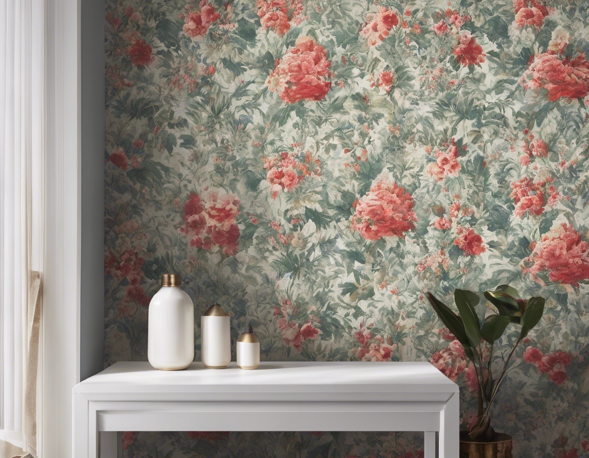
The living room is often the heart of the home, where families gather and guests are entertained. Warm tones like oranges and yellows can create a friendly and inviting atmosphere, while greens and blues can bring a sense of tranquility.
For bedrooms, calming colors such as soft blues, greens, and lavenders are ideal as they are known to help reduce stress and encourage sleep.
Reds and yellows in the kitchen can stimulate the appetite and promote social interaction, making them great choices for a space that's often the site of conversation and communal cooking.
In a home office, colors like green can enhance concentration and calmness, while blues can help reduce stress and promote productivity.
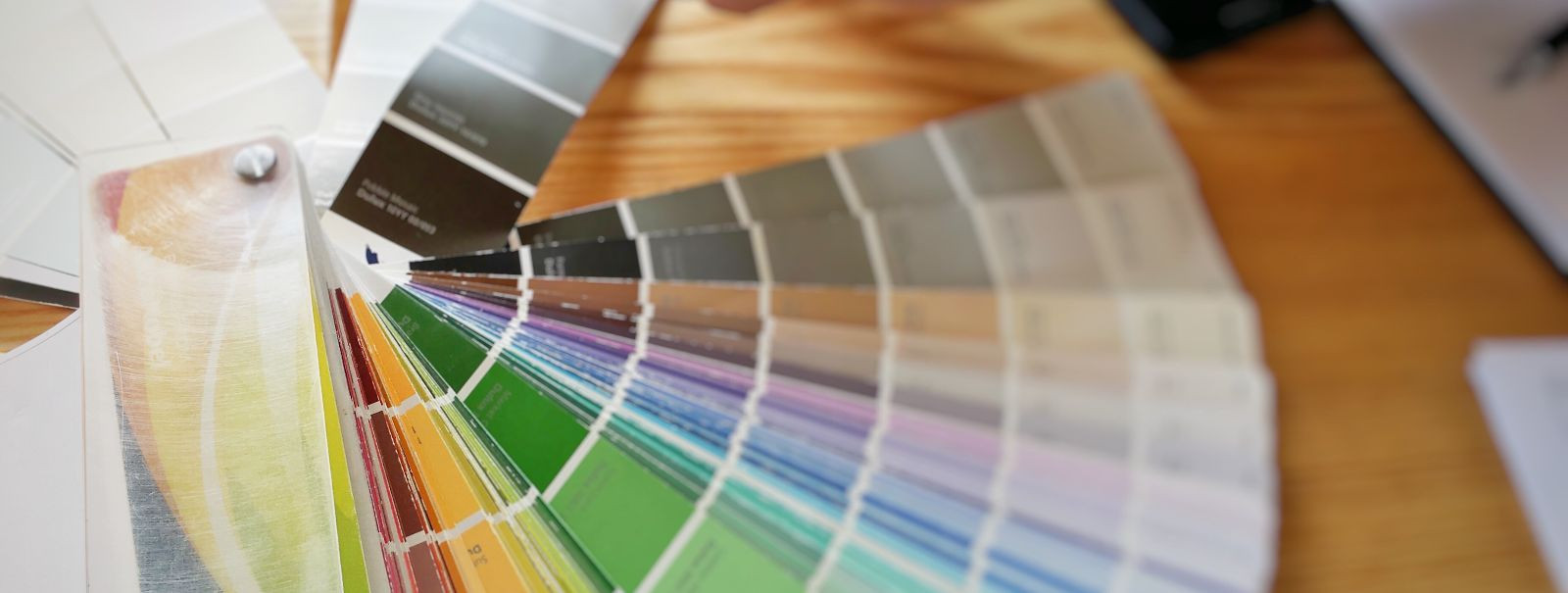
Choosing Your Color Palette
Begin by selecting a base color that aligns with the desired mood and function of your space. This color will serve as the foundation for your palette and influence your choice of complementary and accent colors.
Complementary colors are opposite each other on the color wheel and can create a vibrant look when used together. Accent colors are used sparingly to add interest and depth to a room.
Color temperature refers to the warmth or coolness of a color. Warm colors can create a cozy and inviting space, while cool colors can make a room feel more open and serene.
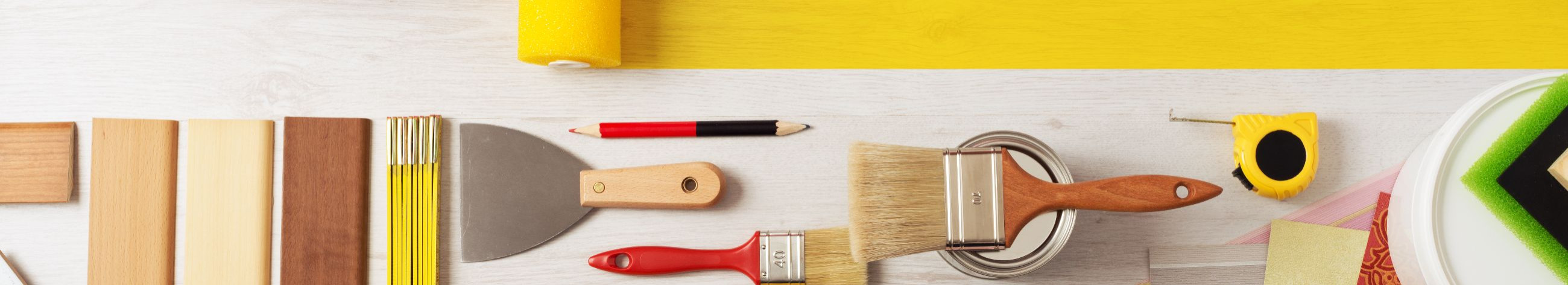
Practical Tips for Implementing Your Color Palette
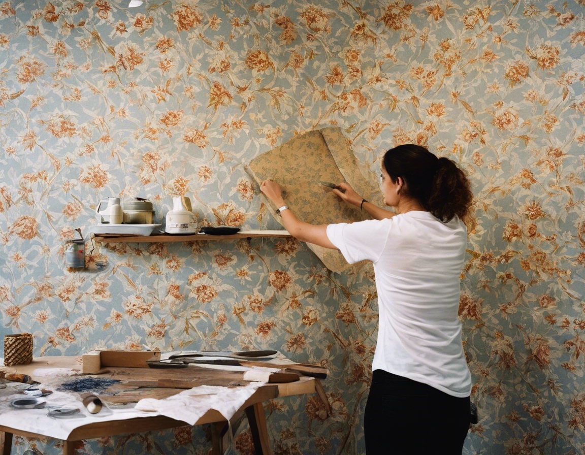
Before making a final decision, test your chosen colors in the space. Observe how they change throughout the day and under different lighting conditions.
Textures and materials can affect the appearance of colors. Glossy finishes will reflect more light and may make colors appear lighter, while matte finishes absorb light and can make colors look deeper.
Once you've tested colors and considered various elements, finalize your color choices with confidence, knowing they will enhance the mood and functionality of your space.
Comments (0)