


The ultimate guide to choosing paint colors

Choosing the right paint color for your space is more than just an aesthetic decision; it's a psychological one. Colors have the power to influence mood, emotions, and perceptions. For instance, blues and greens are often associated with calmness and serenity, while reds and yellows can evoke feelings of energy and excitement. Understanding the psychological impact of colors can help you create the desired atmosphere in your space.
Lighting plays a crucial role in how paint colors are perceived. Natural daylight shows the truest color, while incandescent lighting brings out warm tones and fluorescent lighting casts a sharp blue tone. It's essential to consider the lighting conditions in your space when selecting paint colors to ensure the color looks as intended at all times of the day.
While it's tempting to follow the latest color trends, it's important to consider whether a trendy color will feel outdated in a few years. Timeless colors, on the other hand, can offer longevity and adaptability to changing decor. Balancing trendy elements with classic choices can create a space that feels both modern and enduring.
Assessing Your Space and Needs
The function of a room should guide your color choice. For example, a bedroom might benefit from soothing, muted tones, while a home office might require energizing colors that promote focus and creativity.
Your existing furniture and decor should inform your paint color decision. Selecting a color that complements your current items will create a cohesive look and feel. Consider the dominant colors in your space and choose a paint color that will harmonize with them.
The size and shape of your room can influence the perception of color. Light colors can make a small room feel larger and more open, while dark colors can add depth and warmth to a larger space. Consider the dimensions of your room and how color can enhance or alter its appearance.
Color Theory and Combinations
The color wheel is a fundamental tool for understanding color relationships. Primary, secondary, and tertiary colors are arranged in a circle, allowing you to see how colors interact with each other. This knowledge is crucial for creating harmonious color schemes.
Complementary colors are opposite each other on the color wheel and can create a vibrant look when used together. Analogous colors are next to each other and offer a more harmonious and serene look. Monochromatic schemes use variations in lightness and saturation of a single color to create a cohesive and elegant look.
Colors are also categorized by temperature: warm, cool, or neutral. Warm colors can create a cozy and inviting atmosphere, while cool colors can make a space feel calm and restful. Neutral colors offer flexibility and can serve as a backdrop for more vibrant accents.
Sampling and Testing Colors
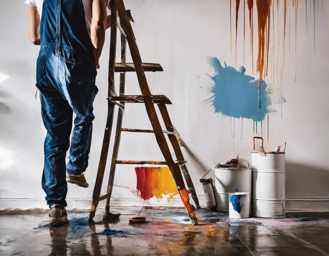
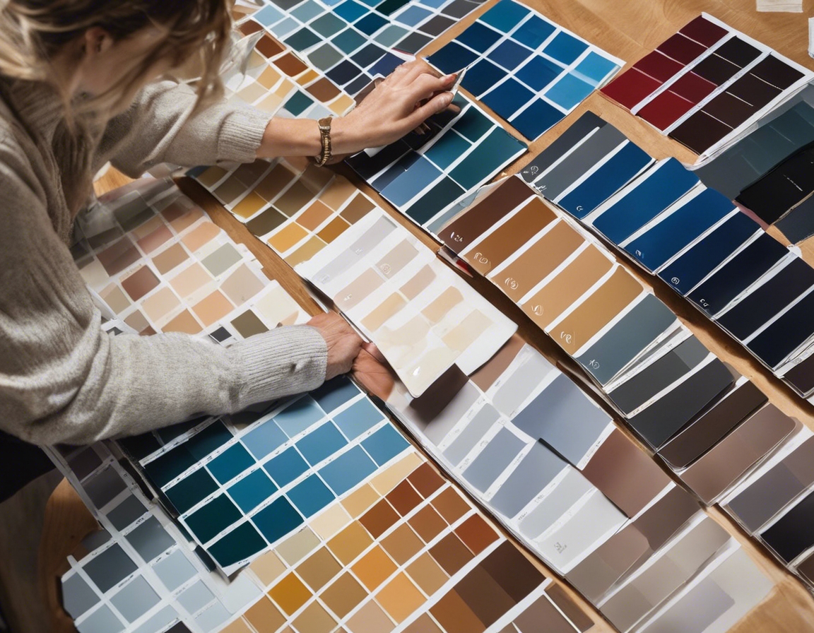
Before committing to a paint color, it's essential to test samples in your space. Paint swatches and sample cans allow you to view the color on your walls and observe how it changes in different lighting conditions throughout the day.
Paint colors can look drastically different under various lighting conditions. Test your paint samples on different walls and at different times of the day to ensure you're happy with the color in all possible scenarios.
The finish of the paint can affect its appearance and durability. Matte finishes can hide imperfections but are less durable, while glossier finishes are easier to clean but can highlight flaws. Consider the room's use and the desired maintenance level when choosing a finish.
Professional Tips and Tricks
Creating a color flow throughout your home can make it feel more cohesive. Professionals often recommend choosing a color palette for the entire home and then varying the shades and tones room by room.
Accent walls or features can add depth and interest to a room. Choose a bold color for an accent wall or feature to create a focal point and add personality to your space.
Color matching can be challenging, especially when trying to coordinate with existing colors. Use color swatches and consult with professionals to find the perfect match or complementary colors for your space.
Comments (0)