

5 tips for choosing the perfect color palette for your space

Before diving into selecting a color palette, it's crucial to grasp the basics of the color wheel. Comprised of primary, secondary, and tertiary colors, the wheel is a valuable tool for identifying harmonious color combinations. Understanding complementary, analogous, and triadic schemes can serve as a foundation for creating a balanced and cohesive color palette for your space.
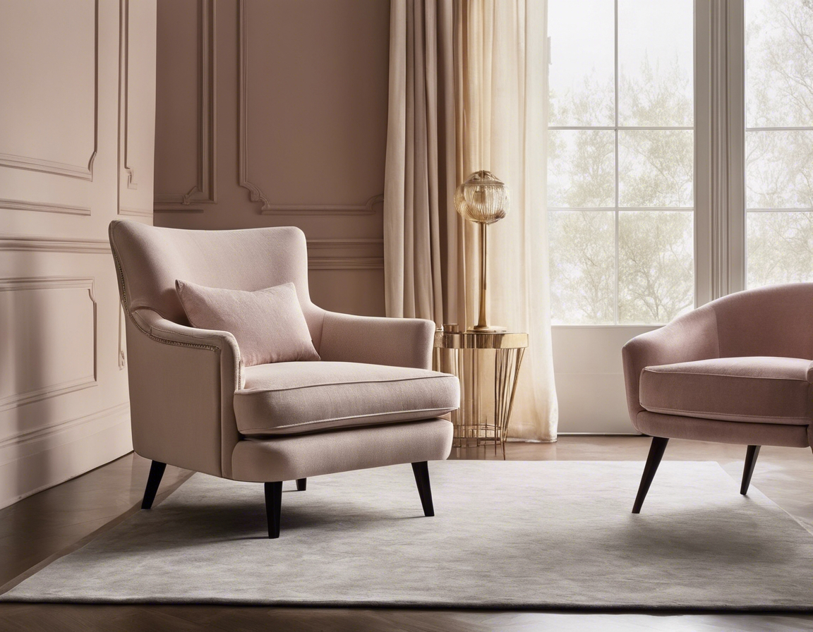
Colors have the power to evoke emotions and set the tone of a room. For instance, blues can be calming, while reds are often energizing. Recognizing the psychological effects of colors can guide you in choosing a palette that not only looks good but feels right for the intended atmosphere of your space.
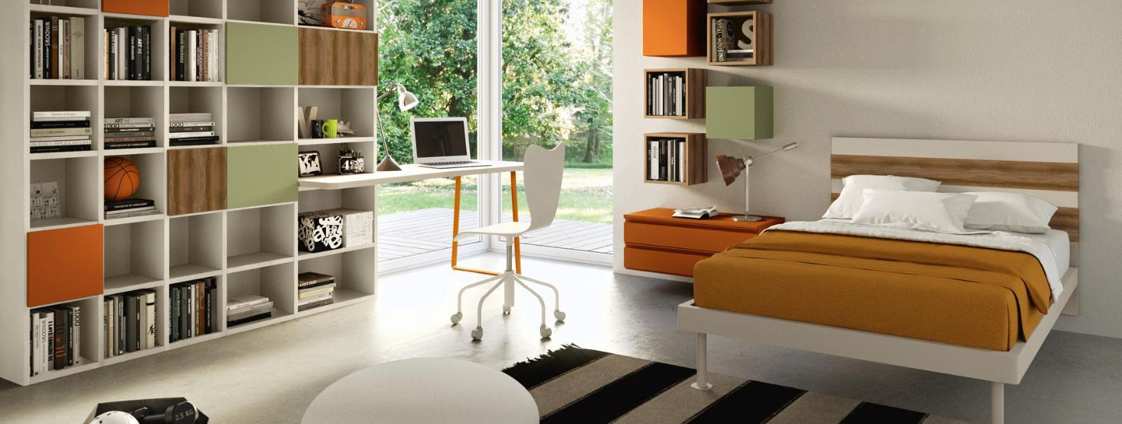
Tip 1: Consider the Room's Purpose and Mood
Each room serves a different function, and the colors should reflect that. A bedroom might benefit from soothing shades for relaxation, while a home office could use colors that stimulate focus and creativity. Aligning your color choices with the room's purpose ensures that your space not only looks beautiful but also enhances its functionality.
The mood you wish to create is just as important as the room's function. Whether you're aiming for a serene retreat or a vibrant entertainment area, your color palette can significantly influence the ambiance. Consider the emotional impact of your color choices to craft a space that aligns with your desired mood.
Tip 2: Start with a Base Color
Begin by selecting a base color that resonates with you and the overall aesthetic you're aiming for. This color will act as the anchor for your palette and set the stage for additional hues. It's often a neutral or a color that can be easily adapted to various themes and styles.
Once you've chosen your dominant color, build your palette by adding complementary or analogous colors. These should enhance the base color and bring depth to your design. Consider using different shades, tints, and tones of your base color to add complexity and interest to your palette.
Tip 3: Take Inspiration from Art and Nature
Art pieces can be a fantastic source of inspiration for your color palette. An existing painting or sculpture in your space can offer a ready-made palette to draw from. The colors within the artwork can guide your choices and create a cohesive look that ties the room together.
Look outside for a color scheme that's been perfected over time—nature. The hues found in the natural world, from the serene blues of the ocean to the earthy greens of a forest, can inspire a palette that's harmonious and soothing to the senses.
Tip 4: Use the 60-30-10 Rule
The 60-30-10 rule is a classic decorating principle that helps create balance and depth in your color scheme. It involves using 60% of a dominant color, 30% of a secondary color, and 10% of an accent color. This formula ensures that colors are distributed in a way that is pleasing to the eye and easy to apply.
Implementing the 60-30-10 rule can help maintain a cohesive look while allowing for flexibility and creativity. Use it as a guideline to distribute your color choices throughout the room, from wall paint to furniture and accessories.
Tip 5: Test Your Colors in the Space
Before making a final decision, it's essential to test your selected paint colors in the actual space. Paint swatches on the walls and observe how they change under different lighting conditions throughout the day. This step can prevent surprises and ensure you're happy with your color choices in the long term.
Lighting plays a significant role in how colors appear in a room. Natural daylight, artificial lighting, and the time of day can all alter the perception of color. Take these factors into account when testing your palette to ensure the colors work harmoniously in your space's lighting conditions.
Comments (0)